
In the ever-evolving world of web design, having a responsive Joomla template is crucial for any website owner. Whether you are building a personal blog, a corporate site, or a portfolio, a responsive design ensures that your Joomla website looks great on any device, from desktops to smartphones. This guide will walk you through the process of creating a responsive Joomla template, covering everything from the basics to advanced customisation techniques.
What is a Responsive Joomla Template?
Understanding the Basics of Joomla Templates
A Joomla template is essentially the backbone of a Joomla website, dictating its layout, design, and overall functionality. It consists of various template files, including HTML, CSS, and PHP, that work together to render your web pages. The template manager within Joomla allows you to install, customise, and manage these templates easily. With the release of Joomla 3, creating a responsive Joomla template has become even more accessible, providing developers with new features and capabilities to enhance their web design.
Characteristics of a Responsive Web Design
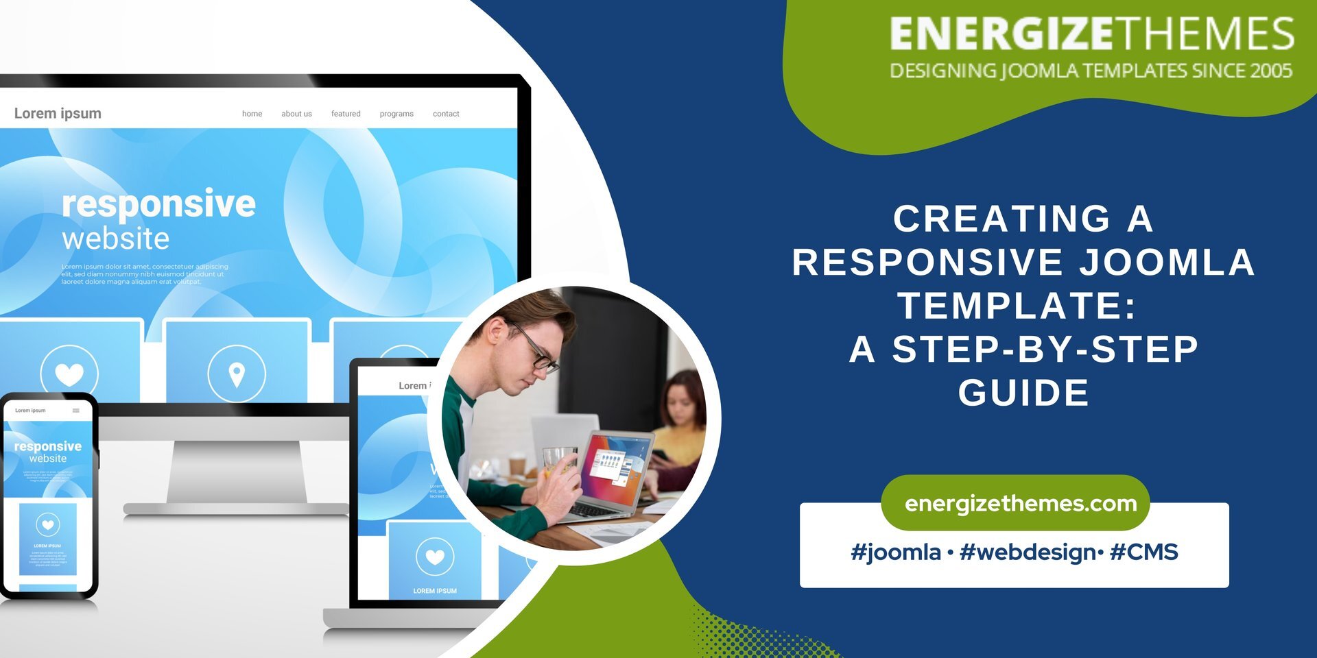
Responsive web design refers to an approach that allows a website to adapt its layout and content based on the screen size and orientation of the device being used. A responsive Joomla template ensures that your site is not just visually appealing but also functional across all devices. Key characteristics of a responsive design include flexible grid layouts, scalable images, and media queries that trigger CSS changes based on the user's device. This adaptability is essential for providing an optimal user experience, which is increasingly important in today's mobile-first world.
Importance of Using a Responsive Joomla Template
Using a responsive Joomla template is vital for several reasons. First, it improves user experience by ensuring that your content is easily readable and navigable, regardless of the device. Second, search engines like Google favour responsive designs, which can lead to better SEO rankings and increased site traffic. Lastly, with a fully responsive template, you reduce the need for separate mobile and desktop versions of your site, simplifying maintenance and updates. This combination of user satisfaction and technical efficiency makes responsive Joomla templates indispensable for modern web design.
How to Choose the Best Responsive Joomla Template?
Features to Look for in a Joomla Template
When selecting a responsive Joomla template, there are several critical features to consider. Look for templates that offer a flexible layout, allowing you to customise the arrangement of content modules easily. Additionally, ensure that the template comes with various module positions, enabling you to display dynamic content effectively. The best responsive Joomla templates should also support popular extensions enhancing functionality and user engagement. Furthermore, consider templates with built-in SEO optimisation features to help improve your website's visibility on search engines.
Free Responsive Joomla Templates vs. Premium Options
Deciding between free responsive Joomla templates and premium options can significantly impact your project. Free Joomla templates can be a great starting point for those on a budget, offering basic functionalities and designs. However, they often come with limitations, such as fewer customisation options and less support. On the other hand, premium templates usually provide more comprehensive features, better support, and regular updates. They also tend to have more refined designs, helping you to stand out in a crowded digital landscape. Ultimately, the choice between free and premium templates should be based on your specific needs, budget, and the level of customisation you require.
Evaluating Template Layouts for Your Joomla Website
When evaluating template layouts for your Joomla website, consider the overall structure and flow of content. A well-organised layout improves user experience and encourages visitors to explore your site further. Check if the template supports various layout options, such as grid or list views, and whether it allows for easy rearrangement of modules. Additionally, assess how the template adjusts to different screen sizes; a responsive layout should seamlessly transition between desktop, tablet, and mobile views. By carefully considering these aspects, you can select a template layout that meets your design needs while enhancing usability.
How to Create a Basic Joomla Template?
Setting Up Your Joomla Environment
Before creating a basic Joomla template, you need to set up your Joomla environment. First, ensure that you have the latest version of Joomla installed, whether it's Joomla 4 or Joomla 5. Next, familiarise yourself with the Joomla template manager, which is the hub for managing your templates. You will also want to create a development environment, such as a local server, to test your template without affecting a live site. This setup will allow you to experiment with different design elements and structures as you build your new template.
Creating the Basic Template Structure
To create a basic Joomla template, start by creating a new folder in the 'templates' directory of your Joomla installation. Within this folder, create the essential template files, including index.php, templateDetails.xml, and a CSS file for styling. The index.php file will serve as the main layout file for your template, where you will define the structure of your pages using HTML and PHP code. The templateDetails.xml file contains important information about your template, such as its name, version, and author. Once you have these files in place, you can begin building the foundation of your responsive Joomla template.
Utilising CSS for Layout and Design
CSS plays a crucial role in defining the layout and design of your Joomla template. To create a responsive template, you will need to utilise CSS media queries to adjust styles based on the user's screen size. This technique allows you to change font sizes, spacing, and layout arrangements for different devices. Additionally, consider using CSS frameworks, such as Bootstrap, which provide a grid system and ready-made styles that can expedite your design process. By effectively utilising CSS, you can ensure that your Joomla template is visually appealing and functional across various devices.
How to Customise Your Joomla Template?
Using Module Positions for Dynamic Content
One of the key advantages of Joomla templates is the ability to create module positions that allow for dynamic content placement. When customising your Joomla template, define various module positions in your index.php file where users can insert modules, such as menus, banners, or custom content. This flexibility allows you to create a unique layout tailored to your content's needs. Additionally, utilising module positions effectively can enhance user engagement, as it enables you to display relevant information prominently based on your website's goals.
Implementing Responsive Layout Techniques
To ensure that your Joomla template maintains a responsive layout, implement various responsive design techniques. Use flexible grid systems that allow elements to resize proportionally based on the screen size. Incorporate viewport meta tags into your HTML to control layout on mobile browsers. Furthermore, consider using CSS frameworks that facilitate responsive design. By applying these techniques, you can create a template that not only looks good but also provides an exceptional user experience across all devices.
Adding Custom CSS for Unique Design Elements
Customisation is key to making your Joomla template stand out. Add custom CSS to create unique design elements that reflect your brand identity. This can include modifying colours, fonts, and button styles, as well as creating hover effects and animations. By incorporating these custom styles, you can enhance the visual appeal of your Joomla template, making it more engaging for visitors. Moreover, ensure that your custom CSS is structured logically and efficiently, as this will help maintain the performance and load times of your Joomla website.
What Are the Best Practices for Packaging the Template?
Understanding the Template Packaging Structure
Once you have completed your responsive Joomla template, it’s crucial to understand the packaging structure before distribution. A well-packaged template ensures that users can easily install and use it on their Joomla websites. Your template package should include all necessary files, such as the template files, CSS, JavaScript, and images, in an organised manner. Additionally, ensure that your templateDetails.xml file is correctly configured, as it contains vital information needed during installation. Proper packaging will enhance user experience and minimise potential installation issues.
Testing Your Joomla Template Before Going Live
Before going live with your new Joomla template, thorough testing is essential to ensure that it functions correctly across different browsers and devices. Check for responsiveness by viewing your template on various screen sizes and resolutions. Additionally, test all module positions to confirm that content displays correctly. It's also important to verify compatibility with different versions of Joomla and various extensions. By conducting comprehensive testing, you can identify and resolve any issues, ensuring a smoother experience.
Elevate Your Joomla 4 Website with a Mobile-Responsive Template
In conclusion, developing a mobile-responsive Joomla 4 template is essential for ensuring your website adapts to the increasing demand for seamless mobile experiences. Whether you're a seasoned developer or just starting, a mobile-first approach will set your projects up for success. For those looking to save time and effort, why not explore our already mobile-responsive Joomla templates? Designed with both functionality and aesthetics in mind, they provide the perfect starting point for your next project. Visit Energize Themes today and purchase your template to stay ahead of the curve!


