This guide shows you how to install and set up the Render Joomla template.
Current release: Render 6.2.0, released 6 November 2026. Built for Joomla 6 (6.1 or later). PHP 8.3 or later. Quickstart: Joomla 6.2.0. What changed in each release.
Table of Contents
- What Render Is For
- What You Need
- What You Get
- Which Should I Install, The Quickstart Or The Template
- Installing The Quickstart
- Installing Just The Template On An Existing Site
- What To Do First
- How Do I Open The Template Settings
- How Do I Add My Logo And Slogan
- How Do I Change The Colours
- How Do I Change The Fonts
- How Do I Set Up The Favicon
- Template Module Positions
- How Do I Set The Width And Background Of An Area
- How Do I Set Up The Header
- How Do I Set Up The Main Menu
- How Do I Set Up The Mega Menu
- How Do I Set Up The Slideshow
- How Do I Add A Header Picture To An Inner Page
- How Do I Set Up The Tabs
- How Do I Set Up The Testimonials
- How Do I Set Up The Pop-up Panels
- How Do I Add My Own Text And Banners
- How Do I Change How A Module Looks
- How Do I Set Up The Login And Register Icons
- How Do I Set Up The Search
- How Do I Set Up The Social Icons
- How Do I Set Up The Footer
- How Does It Work On Phones
- How Do I Add My Own CSS Or Analytics Code
- How Do I Keep It Up To Date
- Where To Get Help
What Render Is For
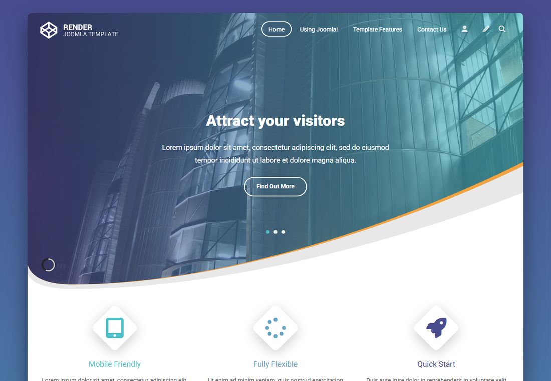
Render is a clean Joomla 6 template for tech and digital firms and other modern businesses. Its look comes from curved sections and a colour gradient behind a white page.
- Six built-in colour themes, and ten colours of your own
- 68 module positions you can use
- A built-in slideshow, and header pictures for inner pages
- Parallax background pictures in most areas of the page
- A built-in mega menu
- Tabs, testimonials and pop-up panels built in
- A set of ready-made module styles
- A choice of fonts, including Google Fonts
- Its own phone layout
It does not include a shop. For an online store, look at the shop templates.
What You Need
- Joomla 6 (6.1 or later). The Quickstart includes Joomla 6.2.0.
- PHP 8.3 or later.
- Web hosting and a database that meet Joomla's technical requirements.
- No other extensions. The template does not need a page builder or a shop component.
Want to see it first? The Render demo runs this same release.
What You Get
After you buy Render, its files are in My Downloads. Open the render folder.
- Joomla5 / quickstart / render-quickstart-J6.2.0.zip: a complete Joomla 6.2.0 site with the template and the demo content.
- Joomla5 / Template Files / pkg_render-6.2.0.zip: the template on its own, for a site you already have.
- Photoshop Files: render-photoshop-file.zip holds the design file (172-Render.psd).
- Joomla3: the old version of the template for Joomla 3. You do not need it for a new site.
The folder is called Joomla5, but the files inside it are the Joomla 6 release. The name on the zip file is the one to go by. Each of the two folders also has a short readme.txt.
Which Should I Install, The Quickstart Or The Template
Starting a new site? Use the Quickstart. Your site starts out looking like the demo, and you replace the content with your own. This is the easiest way to learn how Render is put together.
Adding Render to a site you already have? Install only the template. Your articles and menus stay as they are, and you set up the modules yourself using this guide.
Never install the Quickstart over a site you already have. It is a whole new Joomla site and it would replace your content.
Installing The Quickstart
- In your hosting control panel, create an empty database and a database user, and note the details.
- Upload render-quickstart-J6.2.0.zip to your hosting account and extract it where you want the site. Use a sub-folder to try it out, or the main web folder for a real site.
- Visit
https://your-site/installation/index.phpand follow the normal Joomla installer. You enter your database details and create your own administrator account. No shared password comes with the package. - When the installer finishes, the
installationfolder is removed and your Render site is ready.
The Quickstart guide goes through these steps in more detail.
Installing Just The Template On An Existing Site
- Log in to your Joomla administrator area.
- Open System and, in the Install panel, select Extensions.
- On the Upload Package File tab, drag in pkg_render-6.2.0.zip or select Or browse for file and choose it. Joomla installs it as soon as the upload finishes.
- Open System and, in the Templates panel, select Site Template Styles.
- Tick the check box next to the Render style and select Default in the toolbar.
Using the package, rather than a bare template zip, also registers the template with Joomla's Update Manager. New releases then appear under System, in the Update panel, under Extensions.
Next, go to What To Do First. Your existing modules keep their old position names, so they will not show until you move them to Render positions.
What To Do First
- On a Quickstart site, note that there are two template styles. The second, "(Home page)", is assigned to your Home menu item only. It is the same as the first, plus one line of CSS for the footer on the home page. Change your logo, colours and fonts in both styles, or your home page will not match the rest of the site.
- Pick a colour theme on the Color tab. The demo uses Theme 1.
- Add your logo or type your site name.
- Set up the main menu in position-1.
- Replace the slides with your own pictures and words.
- Replace the sample modules. On a Quickstart site, the home page modules hold placeholder text. Edit them, or unpublish the ones you do not need. Positions with nothing published close up.
- Change the footer and your social links.
- Check it on your phone.
How Do I Open The Template Settings
- Open System and, in the Templates panel, select Site Template Styles.
- Select the name of your template style to open it.
The settings are on these tabs:
- Favicon: the small icon in the browser tab
- Site Name & Slogan: your logo and slogan
- Theme: the header, and the width and background of each area of the page
- Fonts: text size and fonts
- Community Links: the social icons
- Drop Down Menus: the mega menu
- Header & Footer Custom Code: your own CSS, and code for analytics
- Built-in Slideshow: how the slideshow behaves
- Testimonials Slider: the testimonials box
- Side Pop Up Box: the boxes at the edge of the screen
- Color: colour themes and your own colours
How Do I Add My Logo And Slogan
- Open System and, in the Templates panel, select Site Template Styles.
- Select the name of your template style to open it.
- Select the Site Name & Slogan tab.
- To use text, type your name in Site Name, then set Site Name Color and Site Name Font Size.
- To use a picture, set Site Name as Image to Yes and choose your logo in Built-in Site Name. Keep your name in Site Name too, because it becomes the logo's alt text. The demo logo is 184 by 41 pixels.
- Use Site Name Position X and Y to move it. The slogan has the same options further down the tab.
- Select Save & Close.
Site Name linkable makes the logo and slogan link to your home page. It is on by default. To change the height of the header, use Top Handler Height on the Theme tab. The demo uses 60.
How Do I Change The Colours
- Open System and, in the Templates panel, select Site Template Styles.
- Select the name of your template style to open it.
- Select the Color tab.
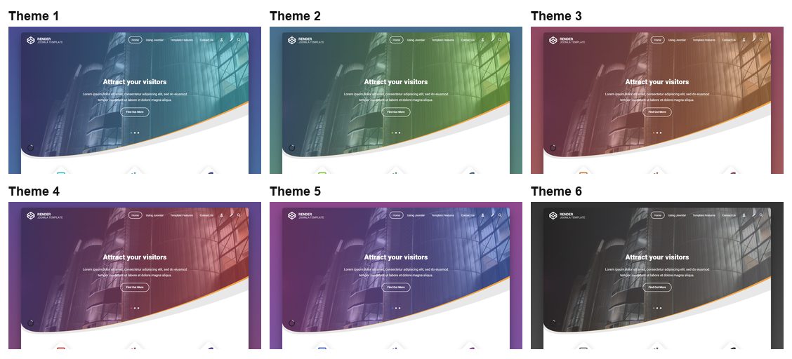
- To use a ready-made look, set Built-in Theme to Yes and pick one in Choose Theme. Theme 1 is teal and indigo, Theme 2 is green, Theme 3 is orange and plum, Theme 4 is red and purple, Theme 5 is blue and purple, and Theme 6 is grey.
- To choose your own colours, set Built-in Theme to No. Click any colour field to open the colour picker. Gradient Color 1 and 2 set the colours behind the page, and the other fields set the text, accents and backgrounds. With a built-in theme on, these fields are ignored.
- Select Save & Close.
To use a picture behind the whole page, choose it in Background Image under Basic Settings on the Theme tab.
How Do I Change The Fonts
- Open System and, in the Templates panel, select Site Template Styles.
- Select the name of your template style to open it.
- Select the Fonts tab.
- Set the size, weight and Default Font Family. The list has web-safe fonts and eight Google Fonts. The demo uses Google Roboto.
- Use Select Character Set if your language needs extra characters.
- To use another Google Font, set Use additional Google Fonts to Yes and type its name in Type Google Font Family Name, exactly as Google Fonts shows it.
- In Google Font Family, enter the weights and character sets, for example
400,700:latin,latin-ext. - In Tags/CSS Classes affected, list where to use it, for example
h1, h2, h3. - To use only your own font, turn on Override default settings, then save.
Google Fonts load from Google's servers, so check whether your privacy policy needs to mention that.
How Do I Set Up The Favicon
- Open System and, in the Templates panel, select Site Template Styles.
- Select the name of your template style to open it.
- Select the Favicon tab and choose an image.
- If it is not square, use the Favicon Crop Tool on the same tab to pick the part you want.
- Select Save. The template creates the icon sizes that visitors' devices need.
Template Module Positions
The picture shows where each position sits. Positions with nothing published in them close up, so the page never shows an empty box.
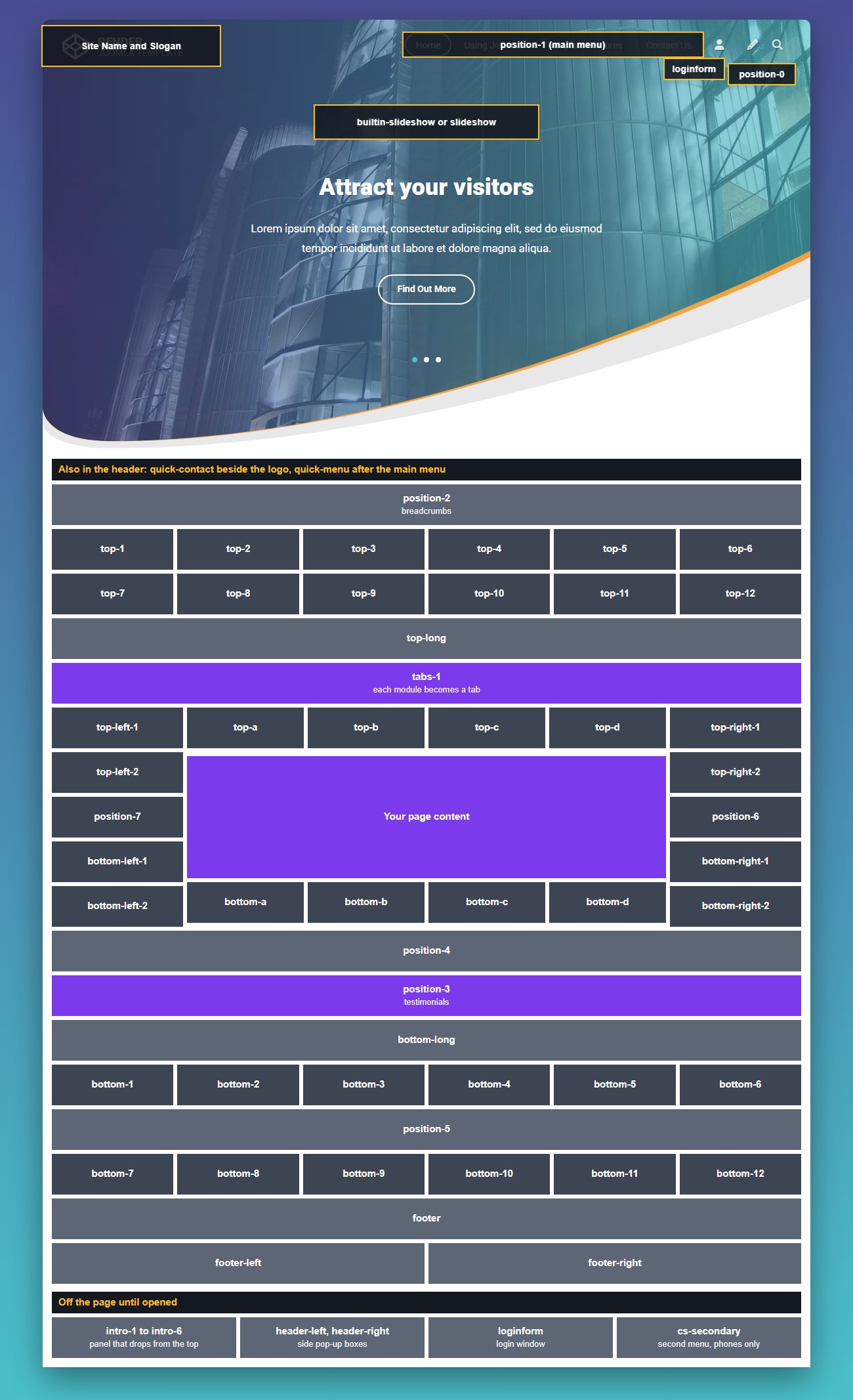
- Header: quick-contact (beside the logo), position-1 (main menu), quick-menu, position-0 (search), loginform
- Under the header: builtin-slideshow or slideshow, position-2 (breadcrumbs)
- Above the content: top-1 to top-6, top-7 to top-12, top-long, tabs-1
- Left column: top-left-1, top-left-2, position-7, bottom-left-1, bottom-left-2
- Centre column: top-a to top-d, your page content, bottom-a to bottom-d
- Right column: top-right-1, top-right-2, position-6, bottom-right-1, bottom-right-2
- Below the content: position-4, position-3 (testimonials), bottom-long, bottom-1 to bottom-6, position-5, bottom-7 to bottom-12
- Footer: footer, footer-left, footer-right
- Off the page until opened: intro-1 to intro-6, header-left, header-right, cs-secondary
Each row shares its width equally between the positions you use. To put several modules side by side in one position, set Bootstrap Size on each module's Advanced tab. The demo has three modules in top-1, each at size 4.
The Position list also shows cart, welcome, top-header, info-line and search. The template does not print these, so a module published there will not appear. Use the positions above.
How Do I Set The Width And Background Of An Area
Most areas of the page have their own group of settings on the Theme tab, for example Top Modules Area, Top Long Modules Area and Footer Modules Area. Each group names the positions it controls.
- Width: Fluid runs the full width of the page. Fixed keeps to the site's width.
- Use Handler Width: Yes keeps the modules to the site's width, while the area's background still runs across.
- Background Image: a picture behind the area.
- Use background image as: choose Static or Parallax. If you add a picture, choose one of these. Parallax makes the picture move more slowly than the page as you scroll.
- Parallax Background Ratio, Vertical Ratio and Image Height: fine-tune the parallax. The demo keeps the defaults.
- Modules Layout and Modules Positions Layout: Seperated, as the setting spells it, keeps a gap between modules, and Plain removes it.
- Align Modules: Center or Stretch for modules in the same position.

The picture above is the demo's top-long area: a Custom module with custom-color4 in Module Class (with the space) for light text, and a parallax background set in Top Long Modules Area. The Parallax page on the demo shows more.
How Do I Set Up The Header
Three settings under Header Area Setting on the Theme tab control the header:
- Header Position: Fixed stays at the top of the screen as the page scrolls, and the demo uses it. Static and Absolute scroll away with the page.
- Header Width: Fixed or Fluid.
- Use Handler Width: as above.
Turn ON/OFF Jump to up button under Basic Settings adds the round button at the bottom right that returns to the top of the page.
How Do I Set Up The Main Menu
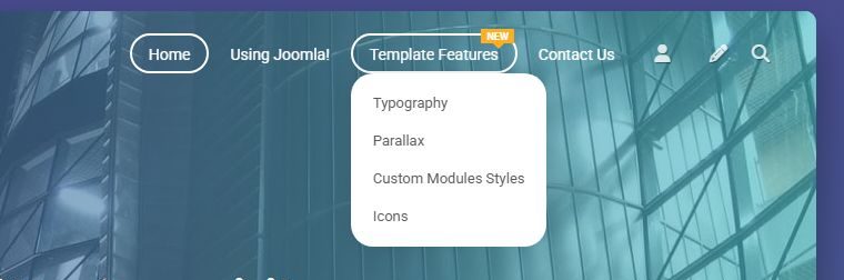
The main menu is a normal Joomla Menu module, with these settings:
- Open Content, select Site Modules, and open your menu module, or select New and then Menu.
- In Menu to Show, choose your menu.
- In Position, choose position-1.
- Set Sub-menu Items to Show so the drop-downs work.
- On the Advanced tab, set Menu Tag ID to
navand Menu Class to-nav, with the dash. - Select Save & Close.
To add a ribbon to a menu item, open it in Menus and type NEW, HOT or FEATURED in its Note field. Any other wording shows as a short line of text under the item.
Use quick-menu for a small second menu after the main one.
How Do I Set Up The Mega Menu
The mega menu replaces the normal main menu. It is off on the demo, so you will not see it there.
- Open Menus, select Manage, and add a new menu. Add your items to it, first level only.
- In the template settings, select the Drop Down Menus tab.
- Set ON/OFF Built-in Mega Menu to Yes and choose your menu in Select a menu for Mega Menu, then save. You can leave the other fields on that tab alone: drop-downs work without them.
To add a drop-down panel to an item, publish modules to its positions. Each item has three rows, named from the item's Alias:
menu-position-1-ALIAS
menu-position-2-ALIAS
menu-position-3-ALIAS
For an item with the alias services, the first row is menu-position-1-services. These names are not in the Position list, so type the name into the Position field and press Enter. Any module type works.
To set the width of a panel, open the menu item and, on its Link Type tab, type the width in Link Class, for example 500px.
How Do I Set Up The Slideshow
Each slide is a Custom module in the builtin-slideshow position. On a Quickstart site, open Slide 1, 2 and 3 and change the pictures and words.
- Prepare a .jpg for each slide. The demo slides are 1170 by 700 pixels (images/slide-1.jpg to slide-3.jpg). The header sits over the top of the slide and the curve cuts across the bottom, so keep the important part in the middle.
- Open Content, select Site Modules, select New, then Custom.
- Enter a title. It is for your reference and does not show on the slide.
- In the editor, add the words shown over the picture. To copy the demo, use the markup below in the editor's source view.
- In Position, choose builtin-slideshow.
- On the Options tab, choose your picture in Select a Background Image.
- On the Advanced tab, set Bootstrap Size to 12 and Module Class to
custom-color4, with the space, as the demo does. - On the Menu Assignment tab, assign it to your home page, then save.
- Repeat for each slide. The module ordering sets the slide order.
<h2 style="text-align: center;"><strong style="font-size: 2.8vw;">Attract your visitors</strong></h2>
<p style="text-align: center;">Your text here.</p>
<p style="text-align: center;"><a class="button" href="#">Find Out More</a></p>
The Built-in Slideshow tab in the template settings controls the rest:
- Turn ON/OFF autoplaying and Slide Duration (ms): whether it plays by itself, and for how long each slide shows. The default is 7000, which is 7 seconds.
- Choose FX Effects and Animation Duration (ms): the change between slides.
- Height and Min Height: the demo uses 56% and 430px.
- Navigation and Pagination: the arrows and the dots.
- Caption Position (space from top): where the words sit.
Using a slideshow extension from another developer? Publish it to the slideshow position, unpublish your slide modules, and set Turn Slideshow ON/OFF to No.
How Do I Add A Header Picture To An Inner Page
The demo's inner pages have a shorter header picture with the page title on it, in place of the slideshow. On a page where builtin-slideshow has a module, the slideshow position does not show, so assign your slides to the home page only.
- Open Content and select Site Modules.
- Select New, then Custom.
- Enter a title and add your text or image in the editor.
- In Position, choose slideshow.
- On the Options tab, choose the picture in Select a Background Image.
- On the Advanced tab, set Module Class to
_style7 text-bottom custom-color4and Module Style to parallax. - On the Menu Assignment tab, choose the pages it should appear on. Use On all pages if it should show everywhere.
- Select Save & Close.
Create one for each page, and assign each to its own menu item. The Quickstart includes eight of them, such as Typography and Contact Us, so you can open one and copy it.
How Do I Set Up The Tabs
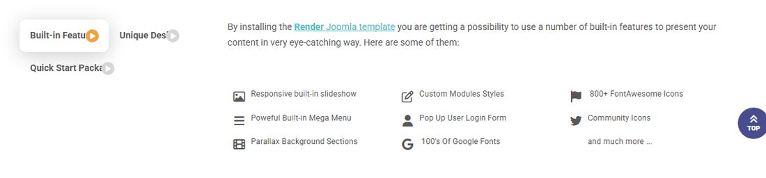
Every module published to tabs-1 becomes a tab, and its title becomes the tab label. The demo has three Custom modules: Built-in Features, Unique Design and Quick Start Package. Set Title to Hide on each, because the tab already shows it.
How Do I Set Up The Testimonials
Each testimonial is a Custom module in position-3, and the box slides between them. The Quickstart includes three, unpublished: Jenet Anderson, Anton Thomas Lee and Samantha Blake. The quickest way to start is to publish those and change the words.
- The module title is the person's name. The text in the editor is what they said.
- On the Options tab, choose their photo in Select a Background Image. The demo photos are 309 by 309 pixels.
- On the Advanced tab, set Module Class to
_style6 tes-down color3. Usetes-upto put the photo above the text andtes-downto put it below.color1,color2andcolor3set the colour. - To show stars, enter
stars5,stars4,stars3,stars2orstars1in Header Class.
Only publish testimonials from real customers. The Testimonials Slider tab in the template settings has the heading above the box (Testimonials Box Label and Testimonials Box Description), how many show at each screen size, and the slider's speed and auto play.
How Do I Set Up The Pop-up Panels
Side pop-up boxes: publish a Custom module to header-left or header-right. A tab appears at the edge of the screen and slides the box open when clicked. The title of the first module in the position becomes the wording on the tab. The Quickstart includes one of each, unpublished: Discover Me and SUMMER SALE. The Side Pop Up Box tab sets each box's position, size and label width, and whether it shows on phones.
Top panel: publish modules to intro-1 to intro-6. They sit in a panel that opens from a small tab at the top of the page. Set its width under Top Pop Up Panel Setting on the Theme tab.
How Do I Add My Own Text And Banners
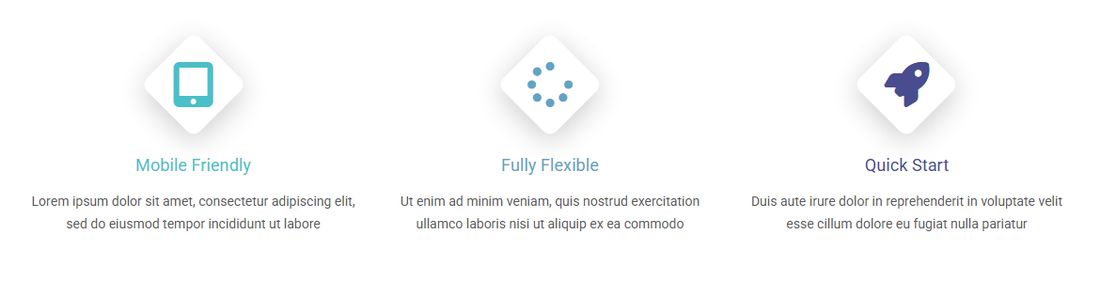
- Open Content and select Site Modules.
- Select New, then Custom.
- Enter a title and add your text or image in the editor.
- In Position, choose the position you want, for example top-1 or bottom-long.
- On the Menu Assignment tab, choose the pages it should appear on. Use On all pages if it should show everywhere.
- Select Save & Close.
To add a button, add this in the editor's source view and change the # to your link:
<p><a class="button" href="#">Find Out More</a></p>To put an icon above the title, as in the picture, enter a Font Awesome icon name in Header Class on the Advanced tab. The demo uses fa-tablet, fa-spinner and fa-rocket. The Icons page on the demo shows what is available.
How Do I Change How A Module Looks
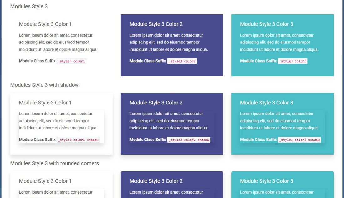
The Custom Modules Styles page on the demo shows them all, with the wording for each. Enter it in the module's Module Class field on the Advanced tab, with no space in front. That page calls the field "Module Class Suffix", which is its old name.
_text,_style1and_style2: simple styles_style3 color1: a coloured box. Usecolor2orcolor3for the other colours, and addshadoworradiusif you want them._style4 color1: a box with a speech-bubble point_style5 color1: text beside a picture, chosen in Select a Background Image_style6 tes-down color1: a testimonial_style7 custom-color4: a parallax picture. Also set Module Style to parallax. To place the text, addtext-top,text-middleortext-bottom.
To make a module slide in as the visitor scrolls, add moveup, movedown, moveleft or moveright after a space, for example _style3 color1 moveup.
How Do I Set Up The Login And Register Icons
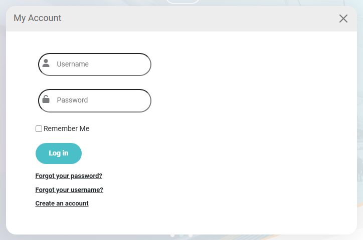
- Open Content, select Site Modules, and open your Login Form module, or create one.
- In Position, choose loginform, and save.
The person icon in the header opens the form in a window over the page, and the module title is the window's heading. The demo calls it "My Account". The pencil icon links to Joomla's registration page.
Not letting visitors register? The pencil icon still shows, so hide it by adding this to Custom CSS:
html body .v_register, html body a#cs-register { display: none !important; }How Do I Set Up The Search
Publish a Smart Search module to position-0. It opens from the magnifying glass icon in the header. Use position-0, because the search position does not print.
How Do I Set Up The Social Icons
- Open System and, in the Templates panel, select Site Template Styles.
- Select the name of your template style to open it.
- Select the Community Links tab.
- For each network you use, enter your full profile address and set its Show switch to Yes. The list is X, Facebook, Instagram, Threads, Bluesky, Mastodon, LinkedIn, YouTube, TikTok, Vimeo, Pinterest, Discord and RSS.
- Select Save & Close.
For anything else, use the five custom icon slots on the same tab: for example, enter the full address in Custom Icon 1 URL, choose an icon in Custom Icon 1 - Select Icon and turn on its Show switch. On a computer, the icons appear at the bottom of the footer.
How Do I Set Up The Footer
The demo footer has three Custom modules in footer (Legal notice, About Us and Contact Us), each with Bootstrap Size 4, and your copyright line in footer-right. On a Quickstart site, open those modules to change the words. Footer Modules Area on the Theme tab sets the background picture, and the demo uses it as parallax.
How Does It Work On Phones
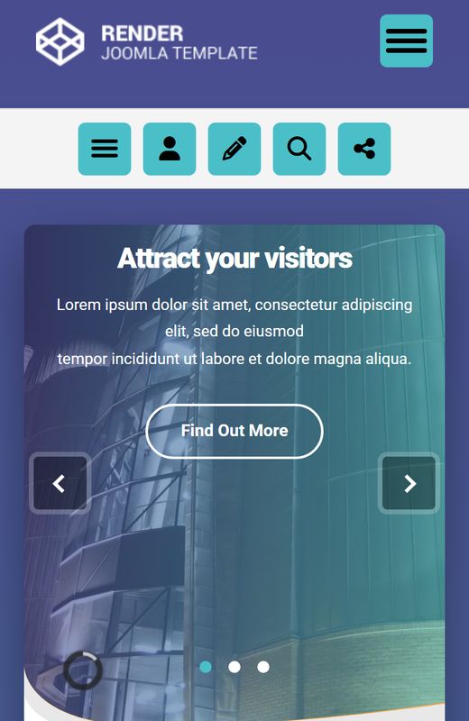
The template adapts without any set-up. The button at the top right opens the main menu. The row under the logo has buttons for a second menu, log in, register, search and your social links, and they use the modules and settings you have already made.
The second menu shows whatever Menu module you publish to cs-secondary. This position shows only on phones. The Quickstart has one, called Phone Second Menu.
How Do I Add My Own CSS Or Analytics Code
- Open System and, in the Templates panel, select Site Template Styles.
- Select the name of your template style to open it.
Select the Header & Footer Custom Code tab.
- Custom CSS: your own CSS, added after the template's stylesheets so it wins. It is saved in the database, so a template update does not touch it.
- Insert code into template header and Insert code into template footer: code for Google Analytics or similar tools. Paste it where your provider tells you to.
For a larger stylesheet, create the file templates/render/css/custom.css. The template loads it if it exists. It is not part of the package, so an update cannot overwrite it.
How Do I Keep It Up To Date
If you installed the package, new releases show up in Joomla under System, in the Update panel, under Extensions. A Quickstart site is not registered for this yet, so install pkg_render-6.2.0.zip on it once, as shown above. The changelog lists what changed in each one. Updates and downloads come with an active membership, and the template keeps working after a membership ends.
Back up your site first. Your settings, modules and Custom CSS are saved in the database, so an update does not change them. If you edited the template's own files, those edits are replaced: keep your changes in Custom CSS or css/custom.css instead.
Where To Get Help
Your membership includes support for using and setting up the template.
- Install the Quickstart on a test folder. It gives you an exact copy of the Render demo, so you can open any module and see how it is set up.
- Read the knowledge base.
- Log in and open a support ticket.
For help with Joomla itself, use the Joomla documentation and the Joomla forum.
Please read the Terms of Service, which you agree to when you buy the template.
